You heard that the only way to generate leads on your website is to create enticing landing pages on your website and drive traffic to it.
And you did.
But, you discovered that instead of your audience filling your form, a large percentage of them simply abandon it. This is referred to as form abandonment.

So, what is form abandonment?
Form abandonment is when someone starts filling out a form on your landing page and they did not complete it before leaving your website. It is the gateway between your website and the visitor.
Form abandonment is a common problem that most marketers face online. A research study revealed that over 60% of websites forms are abandoned. The meaning of this is that out of 10 people that visit your website, 6 of them will leave the form without completing it. This could mean a huge difference in the success of your campaign.
The question is, why will people want to abandon a form?
There are many reasons why people abandon forms on websites such as:
- Asking for too many form fields to fill
- Unattractive and dull CTA button message
- Uninviting CTA button color
- Confusing data form fields
- Inability to understand where users are getting stuck on the form
So, how do you fix form abandonment issues on your website?
Below are five ways you can fix form abandonment problem on your website:
1. Ask for less data
The truth is, the more information you ask, the less people will fill your form. Asking for too much information from your audience can be frustrating and this can lead to form abandonment. Avoid requesting unnecessary information such as:
- Mrs/Mr/Ms
- Country name
- Street address
- Date of birth
- Business phone numbers
- Gender, etc.
However, there are some cases where you will need more information from your audience, depending on what you want to use it for. In such cases, there are two ways you can go about it.
First, start with 1 or two form fields such as name, email address, etc., then carefully ask for more information later on as you get to know them more.
Secondly, you can segment your form into sections with progress button showing at the top. Check the example below from gocompare’s home insurance quote form.

It makes it look simple and easy to fill instead of displaying the whole form on one page. You can start by asking for only their email address, if the prospect is not able to complete the form or go to step two, you already have their email address. You can always follow up to prompt them to complete the form.
According to Quicksprout, asking less question will help your form to convert more.

You can see from the above infographic that asking for age, telephone number, city, state and street address can reduce your conversion rates. You don’t need so much information to convert your audience.
A case study from Expedia that shows that requesting for less information increases conversion rate. They removed the field “company name” from one of the fields on their website and this resulted in a $12 million profit.

Not only that, 37% of their website visitors were abandoning a form field called “phone.” They decided to add the word “optional” to it to enable users to jump the field if they so wish. This doubled their conversion rate from 42.6% to 80%.
2. Adopt pre-filled forms on your website
As we said, a form with too many fields to fill in causes a lot of people to leave a page and it costs to many entrepreneurs a lot of opportunities.
But what if the visitors don’t have to fill the fields themselves?
That changes everything.
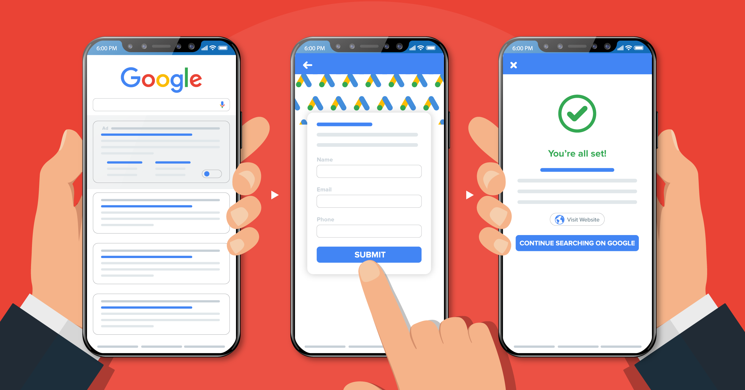
Thanks to the development of new technologies such as LeadsBridge Disruptive Forms, you can finally adopt auto-filled forms on your own website.
If you are not familiar with this tool yet, this is how it works:
As soon as a visitor land on a page on a website with a Disruptive Form and fills in the email field, the technology automatically fills in all the other fields by taking the information from Google, LinkedIn and other sources online. No worries, these are data that the visitor previously willingly shared online.
Pretty magical, from a marketer perspective.
The other cool thing about this tool is that, thanks to a Cross Device Recognition feature, once a Disruptive Forms is filled from desktop or mobile, it will be filled across all the other user’s devices as well.
One of the main advantage of using such tool is that, contrary to what I said in point 1, you won’t need to worry about asking extra information to your users because they are going to be already filled in. Nonetheless, asking too many questions might still feel too invading to some, so pick your fields wisely.
3. Test your Call To Action button message
A form’s CTA is 10 times more important than a traditional CTA. One of the reasons why your audience is abandoning your form may be your CTA button. This is called a Call to action button. It is a button containing a word, phrase or sentence that encourages your audience to take an action.
With the right call to action button on your form, you can persuade your website visitors to subscribe to your email list, thereby turning them into leads. According to ContentVerve, the call to action is the tipping point between conversions and bounce. This means it is the difference between converting your visitors and sending them away from your form and increasing your bounce rate.

A good call to action button should have a text that that is clear, specific and one that tells the user what they will get. For instance, check out the buttons below:
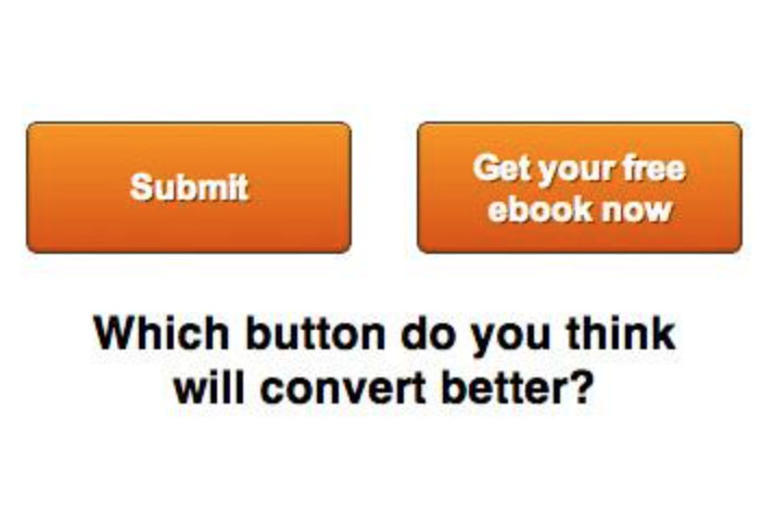
Which one will you click? It is obviously the second button because it tells you what you are getting by clicking.
Using submit button will reduce your conversion rate by 3%.

So, if you are not going to use the word “submit”, what other words can you use? The words you can use include:
- Start e.g.” start the free trial now”
- Grow e.g. “Grow your list now”
- Join e.g. “Join us now”
- Learn e.g. “Learn how to draw”
- See e.g. “See business plans”
- Get e.g. “Get it now”
- Free e.g. “Sign up for free”
For example, check out Leadsbridge and Hoosuite CTA below:
Leadsbridge “Sign up for free”

Hootsuite “See Business Plans”

Again, ensure that your CTA button is placed in a logical placement i.e. along the reader’s path. For example, check out Social Media Examiner CTA logical placement below:

An effective CTA button should not be competing with space for other texts or elements on the page. It should stand out on its own. For example, check out the two competing buttons on digitalisherpa forms below.

It can e confusing for readers to click, which can eventually lead to form abandonment.
It should rather be free like this one below:

4. Test the CTA color
The CTA color is very important. An effective CTA button has a contrasting color. The purpose of a CTA is to attract your audience attention. This is difficult to achieve unless the color is contrasting. The best contrasting colors you can use on your forms are – red and orange.
Below are good examples of forms with CTA button colors from disruptive advertising (red) and social media examiner (orange).

Social media examiner (orange CTA color)

Other colors are green and blue.
A good case study of how CTA button color can impact conversion rates is from a major European e-commerce website that sells hand-crafted porcelain. They changed the CTA button color from blue to green and increased their sales via product pages by 35.81%.

5. Guide your users like they are babies
Although many form fields seem easy to fill, users can find it difficult to understand the information required. This is one way to fix your form abandonment issue. When forms look too difficult to fill, the next thing for a web visitor to do is to abandon it.
For example, if you are asking users to fill in a password consisting of one capital letter, one number, one symbol, etc. It is sounding difficult already. Check out an example in the image below:

If you must use this style, make sure you showed an example of what you want and not leave them to guess.
One way you can help your visitors to better understand the data you need from them is to use validation rule. As they fill the form, if they fill it wrongly, a message is immediately shown to let them know their error and what needs to be in the field. Check out Twitter’s validation rule below:

6. Use the screen recordings tools (hotjar, etc.).
Screen recording tools help you to record, save and replay how your customers are interacting with your website. When you install the tool on your website, it will record visitor’s movements on your website, including how they click, scroll, type or navigate your web pages.
You can also see how they fill your form and where they stopped filling it. It will furnish you with information about where your visitors are getting stuck on your form. You can use this insight to further optimize your form and prevent abandonment.
There are different types of screen recording tools such as:
- Hotjar
- Mouseflow
- Inspectlet
- Smartlook
- Hoverowl, etc.
Conclusion
Form abandonment is a serious issue that must not be taken lightly. It can be the difference between a successful business and a failed one. To fix this issue, request for less information on your landing page form, use LeadsBridge Disruptive Forms, test your CTA button message and color, guide them through the filling process and use a screen recording tool such as Hotjar.
Now it’s your turn.
Have you experienced form abandonment issues on your website? How did you solve it? Share with us in the comment section below.